The goal of this project is to do Exploratory Data Analysis on 911 call data from Kaggle’s ‘Emergency - 911 Calls Montgomery County, PA’ data set. The data contains the following fields:
- lat : String variable, Latitude
- lng: String variable, Longitude
- desc: String variable, Description of the Emergency Call
- zip: String variable, Zipcode
- title: String variable, Title
- timeStamp: String variable, YYYY-MM-DD HH:MM:SS
- twp: String variable, Township
- addr: String variable, Address
- e: String variable, Dummy variable (always 1)
Data and Setup
Import numpy and pandas
import numpy as np
import pandas as pd
Import visualization libraries and set %matplotlib inline
import matplotlib.pyplot as plt
import seaborn as sns
sns.set_style('whitegrid')
%matplotlib inline
Read in the csv file as a dataframe
df = pd.read_csv('911.csv')
Checking the info() of the df to get an overview
df.info()
<class 'pandas.core.frame.DataFrame'>
RangeIndex: 99492 entries, 0 to 99491
Data columns (total 9 columns):
 #   Column     Non-Null Count  Dtype
---  ------     --------------  -----
 0   lat        99492 non-null  float64
 1   lng        99492 non-null  float64
 2   desc       99492 non-null  object
 3   zip        86637 non-null  float64
 4   title      99492 non-null  object
 5   timeStamp  99492 non-null  object
 6   twp        99449 non-null  object
 7   addr       98973 non-null  object
 8   e          99492 non-null  int64
dtypes: float64(3), int64(1), object(5)
memory usage: 6.8+ MB
Check the head of df
df.head(3)
| lat | lng | desc | zip | title | timeStamp | twp | addr | e | |
|---|---|---|---|---|---|---|---|---|---|
| 0 | 40.297876 | -75.581294 | REINDEER CT & DEAD END; NEW HANOVER; Station ... | 19525.0 | EMS: BACK PAINS/INJURY | 2015-12-10 17:40:00 | NEW HANOVER | REINDEER CT & DEAD END | 1 |
| 1 | 40.258061 | -75.264680 | BRIAR PATH & WHITEMARSH LN; HATFIELD TOWNSHIP... | 19446.0 | EMS: DIABETIC EMERGENCY | 2015-12-10 17:40:00 | HATFIELD TOWNSHIP | BRIAR PATH & WHITEMARSH LN | 1 |
| 2 | 40.121182 | -75.351975 | HAWS AVE; NORRISTOWN; 2015-12-10 @ 14:39:21-St... | 19401.0 | Fire: GAS-ODOR/LEAK | 2015-12-10 17:40:00 | NORRISTOWN | HAWS AVE | 1 |
Some Basic Queries.
What are the top 5 zip codes for 911 calls?
df['zip'].value_counts().head(5)
19401.0    6979
19464.0    6643
19403.0    4854
19446.0    4748
19406.0    3174
Name: zip, dtype: int64
What are the top 5 townships (twp) for 911 calls?
df['twp'].value_counts().head(5)
LOWER MERION    8443
ABINGTON        5977
NORRISTOWN      5890
UPPER MERION    5227
CHELTENHAM      4575
Name: twp, dtype: int64
How many unique title codes are there?
df['title'].nunique()
110
Creating new features
In the titles column there are “Reasons/Departments” specified before the title code. These are EMS, Fire, and Traffic. It is useful to have the reasons as a separate column
For example, if the title column value is EMS: BACK PAINS/INJURY , the Reason column value will be EMS.
df['Reason'] = df['title'].apply(lambda title: title.split(':')[0])
What is the most common Reason for a 911 call based off of this new column?
df['Reason'].value_counts()
EMS        48877
Traffic    35695
Fire       14920
Name: Reason, dtype: int64
Getting count for the number of calls based on Reason.
sns.countplot(x='Reason',data=df,palette='viridis')
<matplotlib.axes._subplots.AxesSubplot at 0x1dade12c6d0>

What is the data type of the objects in the timeStamp column?
type(df['timeStamp'].iloc[0])
str
Having timestamps as DateTime objects is more useful than just as strings. Using pd.to_datetime to convert the column from strings to DateTime objects.
df['timeStamp'] = pd.to_datetime(df['timeStamp'])
Now, specific attributes from a Datetime object can be grabbed by calling them. For example:
time = df['timeStamp'].iloc[0]
time.hour
Creating more features from the timeStamp column, Hour, Month, and Day of Week.
df['Hour'] = df['timeStamp'].apply(lambda time: time.hour)
df['Month'] = df['timeStamp'].apply(lambda time: time.month)
df['Day of Week'] = df['timeStamp'].apply(lambda time: time.dayofweek)
Note: The Day of Week is an integer 0-6. This column can be simpler to interpret if the Day of the Week was verbose. Using .map() with a dictionary to map the actual string names to the day of the week should be useful.
dmap = {0:'Mon',1:'Tue',2:'Wed',3:'Thu',4:'Fri',5:'Sat',6:'Sun'}
df['Day of Week'] = df['Day of Week'].map(dmap)
Exploring further to check for relations the Day of Week column Reason column.
sns.countplot(x='Day of Week',data=df,hue='Reason',palette='viridis')

# To relocate the legend
plt.legend(bbox_to_anchor=(1.05, 1), loc=2, borderaxespad=0.)
<matplotlib.legend.Legend at 0x1dade3d4f10>

Doing the same for Month:
sns.countplot(x='Month',data=df,hue='Reason',palette='viridis')

# To relocate the legend
plt.legend(bbox_to_anchor=(1.05, 1), loc=2, borderaxespad=0.)
<matplotlib.legend.Legend at 0x1dade7cf070>

Note: It is missing some months! 9,10, and 11 are not there.
It is useful to have the missing months data for visualization. But there are other ways to visualize the monthly data, like a simple line plot
Creating a gropuby object called byMonth, where the data is grouped by the month column along with the use of count() method for aggregation should give data in a form where it can be easily visualized by months
byMonth = df.groupby('Month').count()
byMonth.head()
| lat | lng | desc | zip | title | timeStamp | twp | addr | e | Reason | Hour | Day of Week | |
|---|---|---|---|---|---|---|---|---|---|---|---|---|
| Month | ||||||||||||
| 1 | 13205 | 13205 | 13205 | 11527 | 13205 | 13205 | 13203 | 13096 | 13205 | 13205 | 13205 | 13205 |
| 2 | 11467 | 11467 | 11467 | 9930 | 11467 | 11467 | 11465 | 11396 | 11467 | 11467 | 11467 | 11467 |
| 3 | 11101 | 11101 | 11101 | 9755 | 11101 | 11101 | 11092 | 11059 | 11101 | 11101 | 11101 | 11101 |
| 4 | 11326 | 11326 | 11326 | 9895 | 11326 | 11326 | 11323 | 11283 | 11326 | 11326 | 11326 | 11326 |
| 5 | 11423 | 11423 | 11423 | 9946 | 11423 | 11423 | 11420 | 11378 | 11423 | 11423 | 11423 | 11423 |
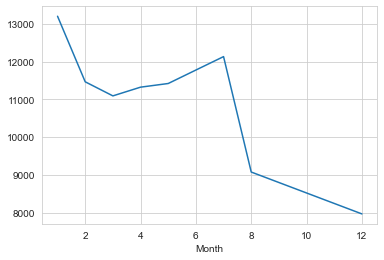
Now a simple plot off of the dataframe indicating the count of calls per month is made.
# Could be any column
byMonth['twp'].plot()
<matplotlib.axes._subplots.AxesSubplot at 0x1dade8bf460>
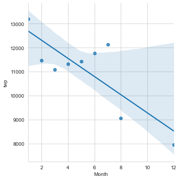
Now we can check if linear fit on the number of calls per month can be plot with lmplot().
NOte: It may be necessary to reset the index to a column.
sns.lmplot(x='Month',y='twp',data=byMonth.reset_index())
<seaborn.axisgrid.FacetGrid at 0x1dade488070>
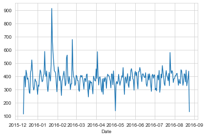
df['Date']=df['timeStamp'].apply(lambda t: t.date())
Now creating a ‘Date’ column and using groupby on this column with the count() aggregate and create a plot of counts of 911 calls should give us the call daily call frequency.
df.groupby('Date').count()['twp'].plot()
plt.tight_layout()
This can be further explored by plotting daily call frequency with respect to ‘Reason’ column for the 911 calls.
df[df['Reason']=='Traffic'].groupby('Date').count()['twp'].plot()
plt.title('Traffic')
plt.tight_layout()

df[df['Reason']=='Fire'].groupby('Date').count()['twp'].plot()
plt.title('Fire')
plt.tight_layout()

df[df['Reason']=='EMS'].groupby('Date').count()['twp'].plot()
plt.title('EMS')
plt.tight_layout()

Visualizing the data as heatmaps with respect to hourly call frequency and day of the week should provide us with a clear picture of the call traffic on a day to day basis. We’ll first need to restructure the dataframe so that the columns become the Hours and the Index becomes the Day of the Week. This can be done by combining groupby with an unstack method.
dayHour = df.groupby(by=['Day of Week','Hour']).count()['Reason'].unstack()
dayHour.head()
| Hour | 0 | 1 | 2 | 3 | 4 | 5 | 6 | 7 | 8 | 9 | ... | 14 | 15 | 16 | 17 | 18 | 19 | 20 | 21 | 22 | 23 |
|---|---|---|---|---|---|---|---|---|---|---|---|---|---|---|---|---|---|---|---|---|---|
| Day of Week | |||||||||||||||||||||
| Fri | 275 | 235 | 191 | 175 | 201 | 194 | 372 | 598 | 742 | 752 | ... | 932 | 980 | 1039 | 980 | 820 | 696 | 667 | 559 | 514 | 474 |
| Mon | 282 | 221 | 201 | 194 | 204 | 267 | 397 | 653 | 819 | 786 | ... | 869 | 913 | 989 | 997 | 885 | 746 | 613 | 497 | 472 | 325 |
| Sat | 375 | 301 | 263 | 260 | 224 | 231 | 257 | 391 | 459 | 640 | ... | 789 | 796 | 848 | 757 | 778 | 696 | 628 | 572 | 506 | 467 |
| Sun | 383 | 306 | 286 | 268 | 242 | 240 | 300 | 402 | 483 | 620 | ... | 684 | 691 | 663 | 714 | 670 | 655 | 537 | 461 | 415 | 330 |
| Thu | 278 | 202 | 233 | 159 | 182 | 203 | 362 | 570 | 777 | 828 | ... | 876 | 969 | 935 | 1013 | 810 | 698 | 617 | 553 | 424 | 354 |
5 rows × 24 columns
Creating a HeatMap using this new DataFrame.
plt.figure(figsize=(12,6))
sns.heatmap(dayHour,cmap='viridis')
<matplotlib.axes._subplots.AxesSubplot at 0x1dade8734c0>

Creating a clustermap using this DataFrame.
sns.clustermap(dayHour,cmap='viridis')
<seaborn.matrix.ClusterGrid at 0x1dade616550>

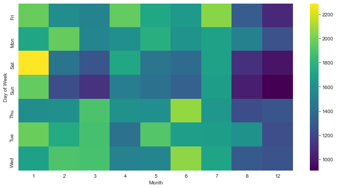
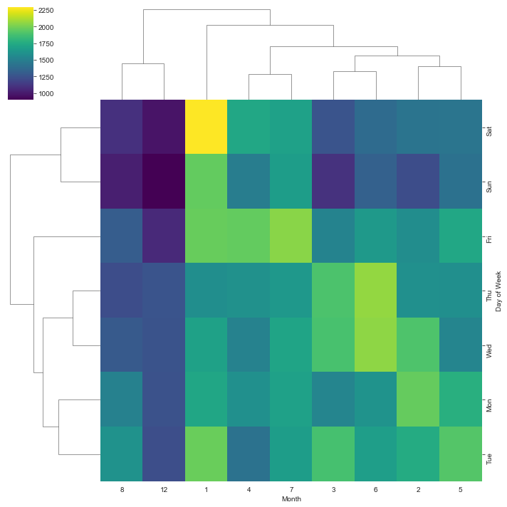
** Now repeating the same plots and operations, for a DataFrame that shows the Month as the column. **
dayMonth = df.groupby(by=['Day of Week','Month']).count()['Reason'].unstack()
dayMonth.head()
| Month | 1 | 2 | 3 | 4 | 5 | 6 | 7 | 8 | 12 |
|---|---|---|---|---|---|---|---|---|---|
| Day of Week | |||||||||
| Fri | 1970 | 1581 | 1525 | 1958 | 1730 | 1649 | 2045 | 1310 | 1065 |
| Mon | 1727 | 1964 | 1535 | 1598 | 1779 | 1617 | 1692 | 1511 | 1257 |
| Sat | 2291 | 1441 | 1266 | 1734 | 1444 | 1388 | 1695 | 1099 | 978 |
| Sun | 1960 | 1229 | 1102 | 1488 | 1424 | 1333 | 1672 | 1021 | 907 |
| Thu | 1584 | 1596 | 1900 | 1601 | 1590 | 2065 | 1646 | 1230 | 1266 |
plt.figure(figsize=(12,6))
sns.heatmap(dayMonth,cmap='viridis')
<matplotlib.axes._subplots.AxesSubplot at 0x1dae03d4f70>
sns.clustermap(dayMonth,cmap='viridis')
<seaborn.matrix.ClusterGrid at 0x1dade6038b0>
Insights
-
On a day to day basis
- It is clear that week days between 1600 hrs to 1800 hrs has peak traffic
- Moderate traffic in the afternoons every week day
- The lowest call traffic is between midnight and 0800 hrs in the morning everyday.
-
On a monthly scale the results are less clear.
- It appears as though weekends in january have more traffic.
- Mid week in june (summer) has moderate calls
- But since there is missing data on a monthly scale, the results remain inconclusive.
Reference jupyter notebook.